After years of working inside real homes—not showrooms, not staged photos, not social media sets—I’ve learned something most homeowners discover too late: not all color trends deserve your trust.
Some look exciting for six months and exhausting after two years. Others quietly hold their ground, still looking intentional long after the hype fades. The difference isn’t luck. It’s understanding how color trends behave in lived-in spaces.
The conversation around the 2026 Color of the Year—Cloud Dancer—proves this point perfectly. On the surface, it’s calm and neutral. In reality, many homeowners and professionals are already questioning its long-term value.
At the same time, deeper tones like Transformative Teal are earning praise because they adapt, endure, and age with dignity. That contrast is exactly why smart color decisions matter—especially when you’re investing in professional interior painting.
Why Color Trends Can Be So Misleading

One hard truth: color trends move faster today than they ever have.
Social media accelerates fatigue. A color that feels fresh today can feel overused by next year. By the time it reaches your walls, it may already be on its way out culturally.
Most color trends are selected far in advance. They’re designed to influence buying behavior, not to survive daily life. Perfect lighting, curated furniture, and edited photos hide the flaws that real homes expose.
As a professional painter, I see the aftermath. Trend-driven rooms get repainted within three to five years, sometimes sooner. Homes that balance trends with timeless choices last significantly longer without regret.
Cloud Dancer 2026: Why the Reaction Is So Divided
Cloud Dancer (#F0EFEB) was introduced as a calming, modern off-white. On paper, it checks every box associated with safe color trends.
In practice, it’s far more complicated.
Many homeowners describe it as flat or emotionally distant. In real rooms—especially those with limited daylight—it can feel cold, unfinished, or even sterile. That reaction isn’t accidental.
Off-white color trends are often tied to recession-era minimalism. They reflect caution, restraint, and neutrality. Once culture shifts toward warmth or personality, those same colors start to feel dated very quickly.
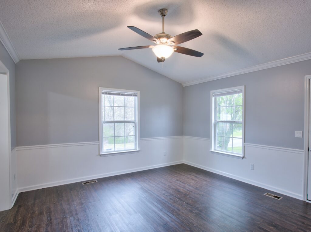
From an interior painting standpoint, Cloud Dancer also highlights wall imperfections, shows scuffs easily, and shifts undertone dramatically depending on lighting. Used sparingly, it can work. Used everywhere, it often disappoints.
Why Transformative Teal Is Aging Better
Transformative Teal (#23545B) tells a different story.
Unlike flat neutrals, this shade has depth. It absorbs light instead of fighting it. It works alongside wood, stone, metal, and modern finishes without clashing.
That’s why deeper color trends often outperform lighter ones long-term. They don’t rely on perfection to look good. They adapt.
In homes across Miramar, FL, I’ve seen deeper accent colors last far longer emotionally than trendy off-whites. When paired with balanced neutrals, they feel intentional instead of fashionable.
The Psychology Behind Color Trends

Here’s what rarely gets discussed.
color trends carry emotional weight. People don’t just see color—they feel it. Over time, colors absorb cultural meaning.
Minimalist whites and pale neutrals are increasingly associated with stress, austerity, and emotional detachment. Richer tones are being embraced because they offer grounding and comfort.
That emotional shift is why some color trends collapse quickly while others quietly endure.
10 Brilliant Color Choices That Actually Pay Off
The smartest color decisions I see follow the same principles again and again.
First, adaptable depth beats extreme neutrality. Colors with some body hide wear, soften shadows, and age better.
Second, trend colors work best as accents. Feature walls, offices, powder rooms, or built-ins are ideal. Whole-house applications are where regret usually starts.
Third, lighting must be tested. Morning light, evening light, artificial bulbs—each changes how color trends behave.
Fourth, undertones matter more than shade names. Floors, cabinets, and trim can completely alter how a color reads.
Fifth, maintenance matters. Trendy light colors show dirt, scuffs, and touch-ups faster than balanced mid-tones.
Sixth, follow more than one forecast. When Pantone and WGSN disagree, risk increases.
Seventh, emotional longevity matters more than popularity. If a color feels tiring after a few weeks, it won’t age well.
Eighth, professional prep and application elevate any color. Execution matters just as much as selection in interior painting.
Ninth, refresh selectively. Sometimes a cabinet respray delivers more impact than repainting every wall with a trend color.
Tenth, trust lived experience over hype. Real homes tell the truth about color trends.
Timeless vs. Trendy: The Balance That Works
The most successful homes don’t chase color trends. They layer them.
Timeless neutrals create a stable foundation. Trend colors provide personality and freshness without locking you into a fast-aging decision.
This approach dramatically reduces repaint cycles. Instead of repainting every few years, homeowners enjoy spaces that evolve naturally.
That’s the difference between reactive painting and professional interior painting strategy.
What Professional Painters Do Differently

We don’t pick colors in isolation.
We evaluate light, surfaces, traffic, and emotional comfort. We think about how a room will feel in two years—not just tomorrow.
That’s why professional interior painting isn’t about chasing color trends. It’s about controlling them.
Final Takeaways on Color Trends That Pay Off
The Cloud Dancer reaction reinforces a lesson painters have learned the hard way: trends fail when they’re treated as permanent.
Deeper, adaptable colors like Transformative Teal last because they respect real environments and real emotions.
The smartest approach blends timeless foundations with selective trend expression, guided by experience—not hype.
When color trends are used intentionally, they enhance a home. When they’re followed blindly, they shorten its visual lifespan.
That difference is where professional insight—and long-term satisfaction—live.

